
Replay
Project Management
Experience Design
Product Design
Front-End Development
Ian Bayly
Simon Le
Project
Year
Social Media app design
Feb – Mar 2021
Team
Role
Overview
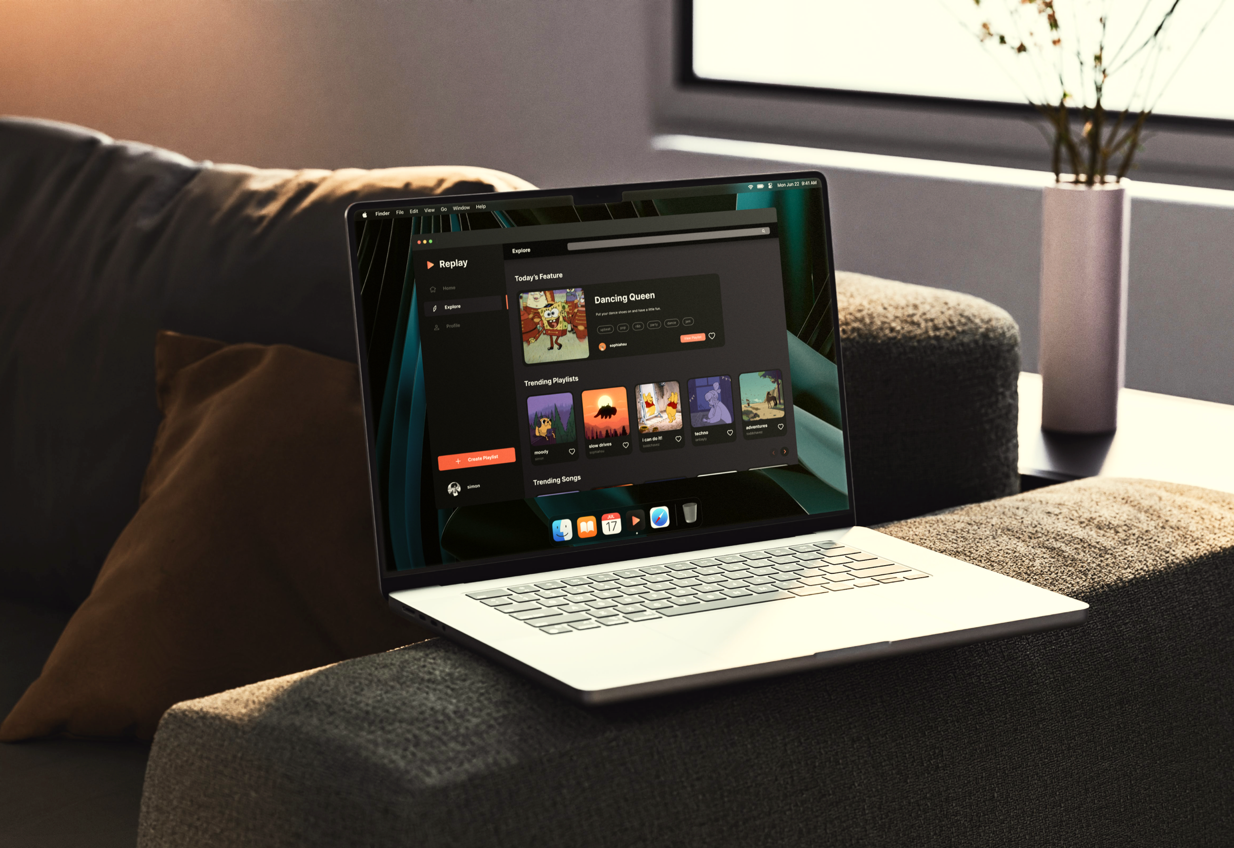
As a team of three, we were tasked to create a social media platform that allowed for the ability to log in, post, and like. As we all took on the roles of both UX /UI designers and front- and back-end developers, together, we created application that allows users to create and share playlists to the public. Meet Replay.
We wanted to create an application that reduces the need to rely on external apps when sharing playlists. Through looking at (would would be considered) Replay’s main competitors- Spotify and Apple Music- we discussed repeating problems that we wanted to solve with our application.
Once our ideation was completed, we took our ideas to InVision and Figma for mockups and user testing, before we coded our application using ReactJS, Node.js (and Express for backend), and Axios.


Background
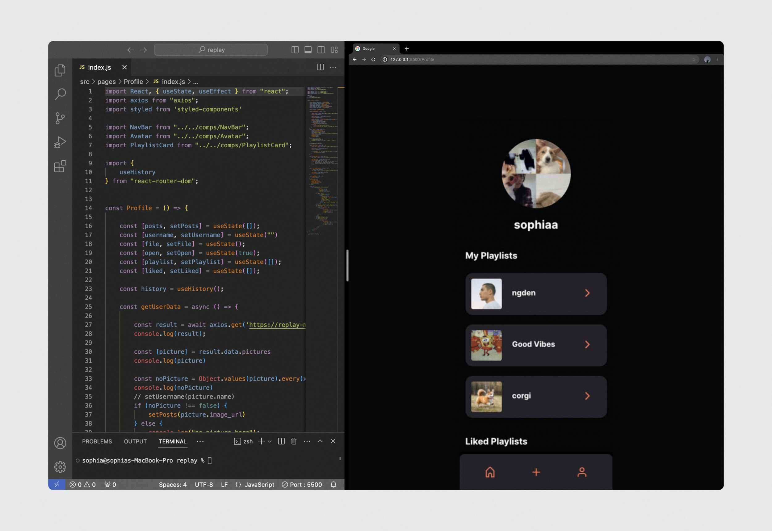
The project is a social media application to allow users— mainly millennials— to share their playlists. Users can find songs, add them to a playlist— which will both show up on the home feed and user profile— and interact with everyone else’s playlists. This concept eliminates the need to share externally if one wanted to recommend a list of songs to their friends.
Idea
Music platforms such as Spotify, Apple Music, Pandora, Soundcloud, and so on exist, however, their main purpose is to listen to music and curate a library for yourself. Although it is possible to find other people’s playlists and interact with them, there are no dedicated features to allow people to discover other people’s playlists with ease.
Problem
Close friends currently have no way of directly sharing each other's playlists that have been created though competitors applications. To do this on other apps, it is a lengthy process that requires navigating lengthy menus to find a specific share option. Then, the user is only limited to sharing a playlist through an external app: by copying a link. This is not optimized, because ideally, app developers do not want to drive their users from clicking away from their application to use a feature in another.
Research
We conducted research to figure out what our target markets' preferences, frustrations, and using habits are. We determined the common users of Spotify and Apple Music to determine which demographic we’d be targeting and designing for. Our primary target markets are Generation Z to Millennials who are tech savvy and active on social media; we wanted to ensure that our app is designed with our target market in mind.
Key findings
Ability to see friends’ activities
Prefers free applications (and no subscription services)
Enjoys a personal-oriented experience; feed is unique to the user
Dislikes push notifications
Preference for mobile over desktop

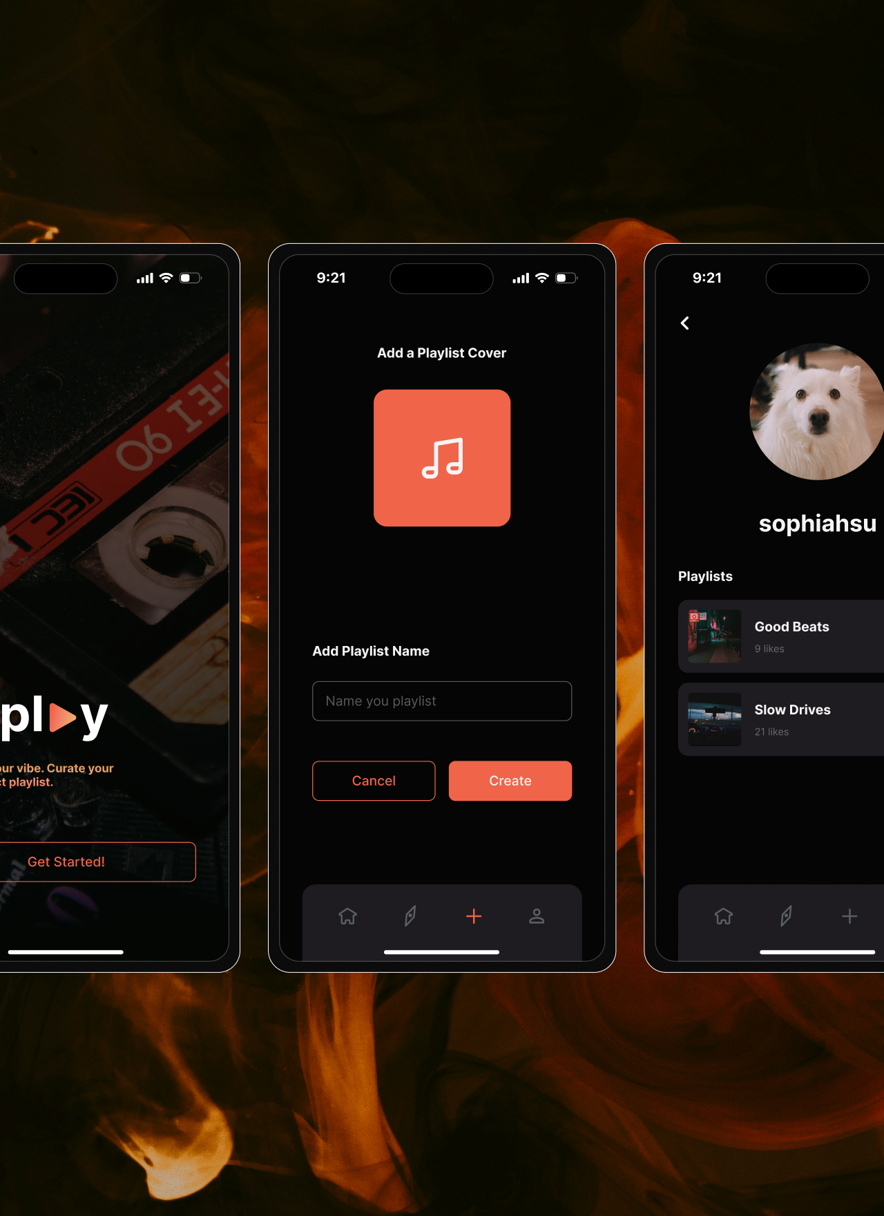
Since we already determined how our database design was, we sketched out design ideas that would allow features that connected with our back-end to exist. On InVision, we brainstormed layouts and focused on routing, as we understood this application required many multi-step interactions.
Sketches
Major iterations
Home page & navigation UX
Problem
Users had a hard time understanding certain icons and navigating through the application. They were placed in unfamiliar locations which made backtracking difficult. A third of the icons were in the top right corner of the screen, which is one of the hardest area of the screen to reach.
01
Solution
Icons were grouped into a navigation bar at the bottom for quicker navigation. Reachability was fixed as users would not have to stretch to move throughout the application. We made our icons more intuitive (explore icon: trending icon to a compass) to remove any room for misunderstanding.
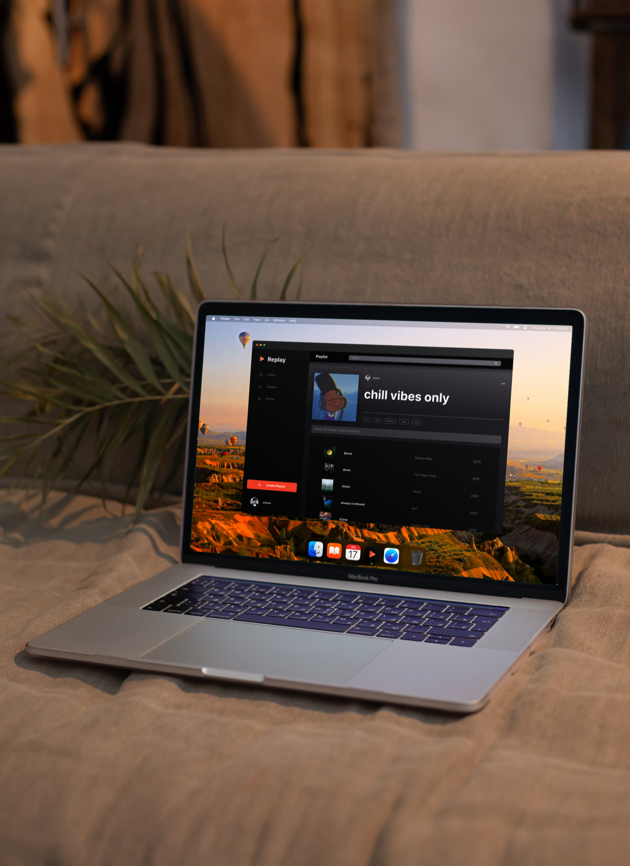
Searching for songs to add
Problem
Users were confused about was that songs appeared in a list of 5 and 10, and that they’d have to click on a button to expand the song selections. They found that extra step annoying and brought up the concern “what happens if the song I’m looking for is not in the top ten search results?”
02
Solution
We determined that having our search bar auto-filter based on user input and have every song that matches the input will make our search song process familiar in comparison to other social media platforms.
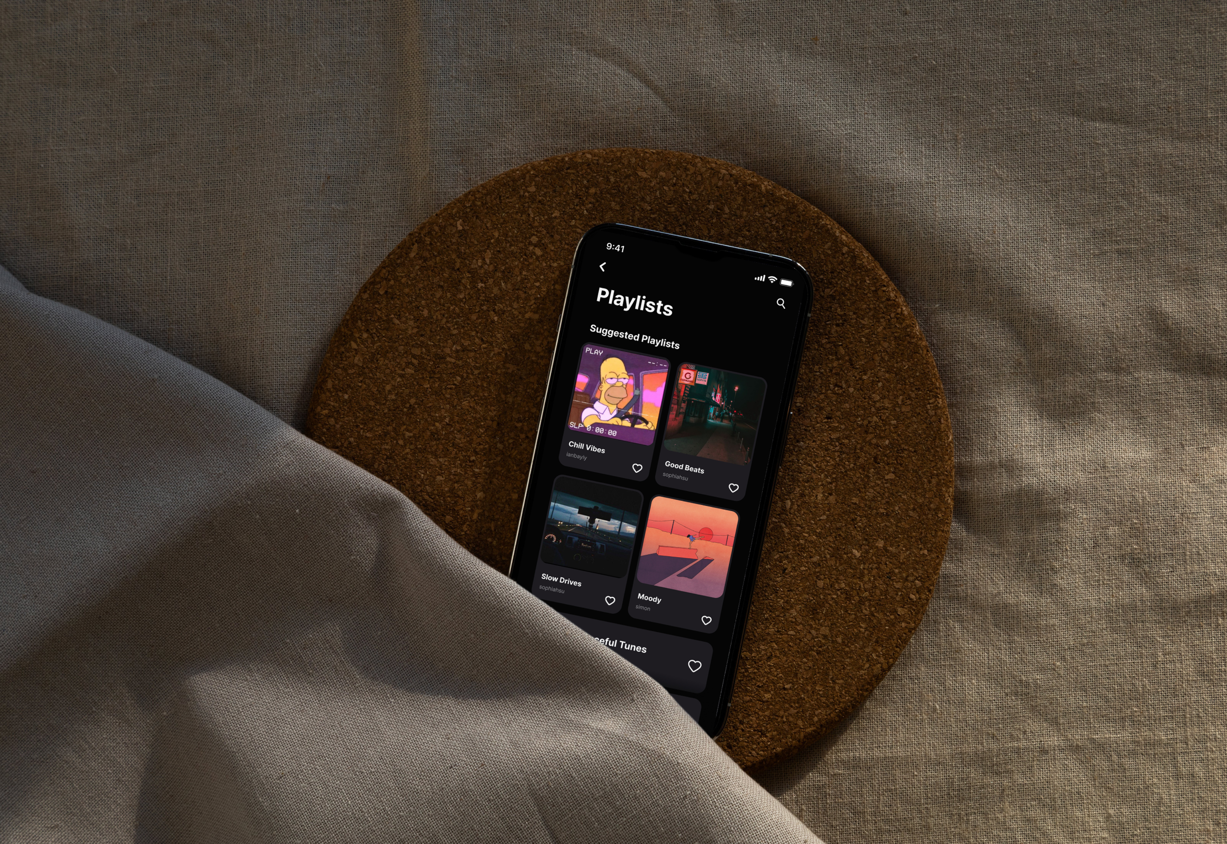
Viewing all playlists
Problem
We received the feedback that although they liked how our playlist cards looked, it will be annoying to scroll through all the playlists if the cards were that size and there were hundreds of playlists in our app’s database.
03
Solution
We determined viewing all playlists was essentially another search feature, there was no need to create a completely different UI than the search feature we already have.
High-fidelity screens
Development
Workspace
A group repository was set up on GitHub so we could collaborate remotely on our local device. We created a two repositories: front- and back-end. Dependencies, components, and style guides were added before each member cloned the repository to make styling and assets consistent throughout.
Front-end
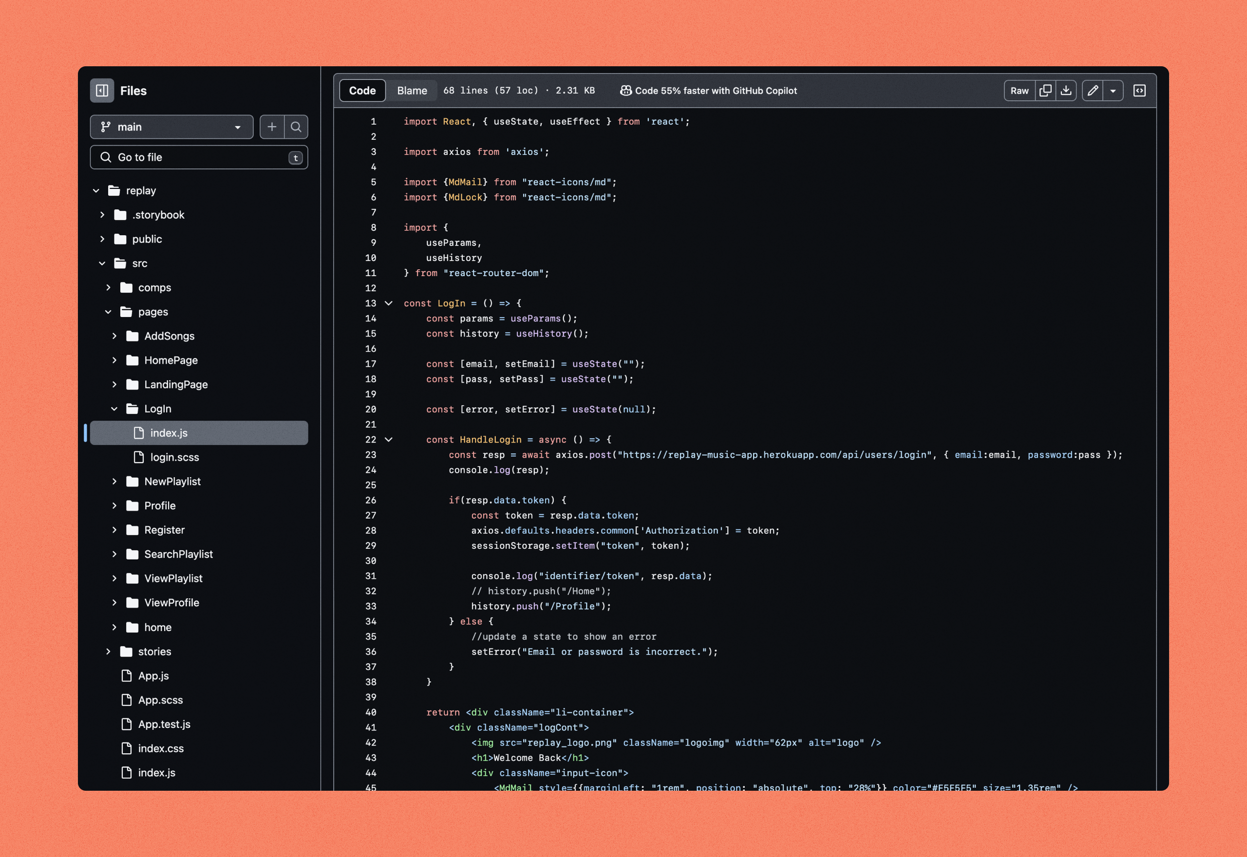
We divided our prototype into components with props set up to make the coding process easier. Axios calls were used to connect front-end to back-end. Tokens were added to all pages apart from the landing page to ensure that each login retrieves the profile and posting capabilities of the user that is logged in.
Back-end
We wrote and tested queries and wrote and tested all necessary functions for our backend. When the back-end was finalized and everything worked successfully, the front-end was able to retrieve, post, delete, update based on the functions called— we deployed our back-end onto Heroku.
Reflection
Key points
Deconstruct before constructing
To better understand how social media platforms are built and why it works so effectively, breaking down the structure if applications and reconstructing them to create our own ideas helped us immensely. Even though popular social media apps all have their own identities, when you break them down, you realise they all have a similar formula.
As users, majority of us are on social media for prolonged periods of time, constantly faced with frustrations from updates and basic usability experiences. Investigating the characteristics that makes up a social media allows us to see and understand common usability flaws and brainstorm solutions.
01
Design base on user needs
We struggled between being completely unique and not being a confusing app to navigate through. Originally, we omitted common app features like a navigation bar, but through testing, our users revealed frustrations without it. We weren’t able to justify not implementing it as it caused more problems that solutions.
Users like familiar interfaces. Learning a new app is a frustrating experience, especially when aspects of it are not intuitive.
02
Constant team communication
From a development perspective, this project emphasized the importance of having a clear and organized idea, and the clarity needed to be carried over when setting up our tables and writing our functionalities. Constant communication is vital when working in a small group to create a large final product, and it was important to be open and honest, to share current struggles and obstacles with one another, in order to advance our project.
As Project Manager, I learned to step out of my comfort zone, reach out to people and ask if they needed help rather than relying on my teammates to come forward. Not only did it increase efficiency and allowed for issues to be resolved quicker, it provided a more open and safe environment for future conversations.
03